From the contact sheet that I created, I decided that to fit in with the colour scheme of my magazine and to stick to the guidelines of my magazine proposal, I would edit my images so that they are black and white with areas of red. Rather than to continuously screenshot my progress, I thought I would use the app 'Quicktime Player' on my mac to record my desktop as I edited one of the chosen images. I then used the app 'iMovie' in order to speed up the video to minimise the length and add a title at the beginning of the video. I then uploaded it to the YouTube channel that I maintain for my media coursework and embedded it into this post. See below:
To talk through the process of the editing, I firstly opened the image that I wanted to edit by selecting File > Open, and then selected the image I desired. I then added a black and white adjustment layer over the image (Layer > New Adjustment Layer > Black and White), in order to make the photo black and white. As there was red originally in the image, I decided that I wanted to bring all of that forward within the black and white. To do this, I identified the areas of red in the original image and simply used the eraser tool to erase the areas of the adjustment layer that weren't required. This would then erase the adjustment layer so that the original image below would be visible, therefore making the red visible. I varied the harshess depending on how I wanted the red to blend out into the black and white, to create the desired natural look. I lowered the harshness on the outer areas of red and heightened it towards the centre of the areas of red. I then used the miser brush tool and blended the areas red into the skin, in order to expel harsh lines and create a natural effect. I completed the image by saving it as a JPEG as this meant it would save as a copy (Photoshop document + JPEG copy), and would be able to be opened within other photoshop documents.
Showing posts with label Final Product Planning. Show all posts
Showing posts with label Final Product Planning. Show all posts
Wednesday, 24 February 2016

Sunday, 21 February 2016
Contact Sheet Creation & Selection of Images
In order to place all of the images I took at the shoot together, I created a contact sheet on photoshop, by selecting File > Automate > Contact Sheet ||. This would allow me to compare all the images together in one place and determine which ones I liked best, which ones added variation to the images I am using, and which suited my genre and target audience.
I then went on to circle in red the images I decided were the best for my magazine and circled them in red, by creating a new layer over the contact sheets. I will paste below the contacts sheets once circled:

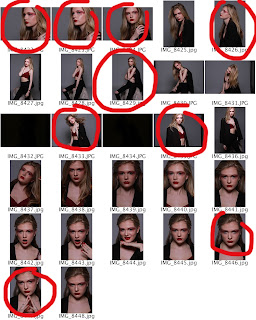
From this, I am taking the images and editing them one by one so that they follow my color scheme. I will post an update of how these images turn out. I will also embed those images into that post.
From the photos I have selected, I have also taken two example images, one that I like and have chosen to use, and one that I dislike and have chosen against using. I think it is important that I fully develop my ideas and explore which images are suitable and why.
 Image I like: This is image feature a close up shot of my model, in which an element of emotion and mysteriousness can be seen. I really love the way in which she is looking upwards as I feel this portrays ideas of hope and optimism within her eyes. The connotations of this image are ideal due to the associated of emotion, linking in with the variety of emotions featured within music, and therefore the range of emotion within my magazine. As my genres are contemporary R&B and indie rock, the songs that are encompassed by these genres will completely range in moods, tones and topics, from love, to anger, to fear, and even misery. I believe an image with intense emotion completely relates to the music and theme of my magazine, and that is why I really like this image and plan on using it. I also particularly enjoy the lighting in this image, and the way the use of make up allows the light to completely bounces from her cheekbones, as well as the way the light highlights the use of red glitter within the make up. The use of red is very important within my magazine due to its prestige within my colour scheme and its various positive connotations. However, I will be making use of photoshop to edit out the area of light on the models nose, due to its unnecessary stand-out effect.
 Image I dislike: Although, I like the use of shot within this image (low-angle shot, displaying power, higher status, strength), I believe the lighting within this image is too dark to highlight the model's complexion, as well as the use of red within the image. The red glitter around the eyes does not appear to be reflecting any light, and there is an element of darkness to it that I don't believe would work with the black and white of the image, once photoshopped. I also believe the model's pose looks slightly uncomfortable and doesn't not appear to have many positive connotations. Therefore, I shall not be using this image.
I then went on to circle in red the images I decided were the best for my magazine and circled them in red, by creating a new layer over the contact sheets. I will paste below the contacts sheets once circled:


From this, I am taking the images and editing them one by one so that they follow my color scheme. I will post an update of how these images turn out. I will also embed those images into that post.
From the photos I have selected, I have also taken two example images, one that I like and have chosen to use, and one that I dislike and have chosen against using. I think it is important that I fully develop my ideas and explore which images are suitable and why.


Saturday, 31 October 2015
Magazine Proposal 1
Describe your idea for the brief:
I am creating magazine based around the Contemporary R&B and Indie Rock Genres, of the name of Velvet. I have chosen this name as music can often be described as of a velvety texture. This creates a feeling off class and beautiful music, which is how I want the music and their artists to be portrayed through my magazine. Velvet will aim to provide it's readers with various information, on areas of the music world, such as new and upcoming artists, up to date charts and typical interviews with current artists who fit into the genres that Velvet is based around, whilst also adding an element of professionalism and class. I will add this element by ensuring that the artists I use are dressed in a way that fits to my magazines theme.
My magazine will take on a theme of red, with the majority of it of its pages in black and white. I believe the back and white will add a fresh new look to the presentation of music rather than churning out the all too often normal coloured photos. This will stand out against other music magazines, with the black and white theme portraying feelings aimed at the dark side of human nature, for example pain and depression. This connotes the way that my magazine will aim to give the audience every aspect of an artist that it interviews, due to their stories of rising to fame often being slightly dark, The addition of red paradoxically creates a sense of joy, symbolising the way music can bring a lot of joy into people's lives. I have chosen red due to it's connotations of power and prestige (e.g. the 'red' carpet), as that is the element of class that I want my magazine to have. Another reason for my choice of red, is due to it's association with being alert (e.g. code 'red'). The music world is all about being alert and finding some great new tunes/artists. This colour will portray my magazine as a magazine that is alert and will provide the audience with up and coming stars that they will be sure to love.
Genre/Sub-Genre: List similar texts which have inspired your thoughts throughout
As mentioned, my genre will be based around Contemporary R&B and Indie Rock. I believe that my main genre out of the two will be Contemporary R&B, with Indie Rock being left as more of a sub-genre, but I will make efforts to ensure that one genre does not fully dominate the other. I believe that more than one genre will give my magazine that extra something, creating a variety within the magazine and also bringing in a wider audience. Inspirations in terms of theme include billboard magazine, through the way in which their front cover image also portrays whatever artist they have chosen in such a good light. The image they use is more than likely always eye-catching and flattering towards the artist. I would like to use an image in my front cover that is attractive, eye-catching and portrays my artist in a positive light, even if it is particularly dark due to my black and white theme. In terms of contents page, I really like the magazine 'Vibe', especially it's contents page of Kanye West because they have a similar colour theme to the one I aspire to have with a black and white image of West, along with a red heart, as the only area of colour, pressed to his chest. I aim to have a contents page of this quality and colour scheme.
Target Audience: gender/age/class/characteristics/behaviour
My primary audience are teenagers ages 16-25, and will be both male and female. In terms of the audience code, readers of Velvet will fit into the E bracket due to the majority of them being students. I believe that students are the the perfect target audience for my music magazine, as they are generally the type you'd see living their lives with their headphones in. They are the majority of those who build up statistics that decided which song is #1 in the UK. This means they will be wanting to know the up and coming artists and the hit songs, and are generally those who are interested in the contemporary R&B and indie rock genres. I'd imagine that my audience generally goes to festivals, studies (whilst listening to music), hangs out with friends, for example at parties, and also goes shopping due to my high class, more expensive aspect of the magazine.
This leaves my secondary audience, being those outside of this age range. This means that I must fit various attributes of my magazine to that age range, for example, the language used and the price range and it's affordability. I also believe that a main secondary audience could include an audience below 16, who are interested in my genres and can afford this magazine. Although, I have not included an age below 16 due to the use of language by some of the artists I incorporate into my magazine and some of the songs that are featured.
Major Conventions: I will use...
...an effective main image, within my front cover, of a celebrity within my genre. This celebrity will be generally popular and recognisable. The image would be printed in black and white but I would make small details in the photo red, but only a small amount of areas to prevent it from looking unprofessional. An example of this could be making the model's lips red (female celebrity) or covering the model in blood that would be coloured red (male celebrity) and leaving the rest of the image black and white whilst the headline is also red along with the various words in the cover lines. This means that the audience's eyes are immediately drawn to important details of the cover; the image, the name of the magazine, and the words that will strike their best interest in the cover lines. My front cover will employ the typical qualities, such as a price, barcode, along with the main story's cover line being enlarged and slightly covering the model in the front cover image. This makes it clear that this is the main article whilst the other cover lines are worked around the model, but never in front. This main article will also link to the image as the main article features an interview with the model in the image. The image used on the cover will also portray certain feelings and perceptions of the model. For example, their facial expression may show sorrow along with a high camera angle in order to make the model look small and belittled by the world which gives ideas as to what their feature article may include and what they may have been through in their lives. The clothing they will wear should be something they would normally wear, or something that relates to the music they create, as this creates a certain mood in the same way their music does and portrays them in a way that allows the audiences to figure out their character. Also, the celebrity endorsement on the front cover will bring in a wider audience from the celebrity's fan-base meaning more magazines sold and more that could be potentially sold in the future if those who have purchased enjoyed the magazine.
Within the double page spread (main article) I will continue to stick to the theme of black and white, but this time I will add more red into the images and into the article itself. As my article is a double page spread, I will be using one page to place an image of my artist which will be printed in black and white, with additions of red. The other page will be filled with the article but I will add the first initial of the artist in the background of the text, filling the full page, in a faded shade of red so that the text is still visible. I will also use puffs once or twice throughout the article. These will be in red and in a bolder, larger text in order to stand out and draw the reader’s attention into the article. The puffs will be extracts from the article that are interesting and will encourage the reader to read the full length article. The celebrity I will use will also be the celebrity that is on the front of the magazine cover. This is because the main article celebrity will be the celebrity that I am focusing in this issue, and most likely will bring in a wider audience due to celebrity endorsement.
In terms of images,I will try to relate the model's poses/stance/facial expression to the article's feeling, for example, if the article is portraying the artist as a strong fierce woman, who has overcome so much within their life, I will place then in a stance that connotes this. This could be anything from the look on their face (strong, and expression you wouldn't mess with) to the way they are standing (clenched fists, feet shoulder-width apart, leaning forward as if to show they are not afraid) or even the way the camera is angled (lower than the model to make the look larger and better, relating to the article).
Potential Difficulties:
One problem that may arise, is the inability to gain use of the photographic studio at the times I would like. If this problem occurs, I may need to take time out of my own to book the studio and ask my model to spare some of her own time to meet me.
I am creating magazine based around the Contemporary R&B and Indie Rock Genres, of the name of Velvet. I have chosen this name as music can often be described as of a velvety texture. This creates a feeling off class and beautiful music, which is how I want the music and their artists to be portrayed through my magazine. Velvet will aim to provide it's readers with various information, on areas of the music world, such as new and upcoming artists, up to date charts and typical interviews with current artists who fit into the genres that Velvet is based around, whilst also adding an element of professionalism and class. I will add this element by ensuring that the artists I use are dressed in a way that fits to my magazines theme.
My magazine will take on a theme of red, with the majority of it of its pages in black and white. I believe the back and white will add a fresh new look to the presentation of music rather than churning out the all too often normal coloured photos. This will stand out against other music magazines, with the black and white theme portraying feelings aimed at the dark side of human nature, for example pain and depression. This connotes the way that my magazine will aim to give the audience every aspect of an artist that it interviews, due to their stories of rising to fame often being slightly dark, The addition of red paradoxically creates a sense of joy, symbolising the way music can bring a lot of joy into people's lives. I have chosen red due to it's connotations of power and prestige (e.g. the 'red' carpet), as that is the element of class that I want my magazine to have. Another reason for my choice of red, is due to it's association with being alert (e.g. code 'red'). The music world is all about being alert and finding some great new tunes/artists. This colour will portray my magazine as a magazine that is alert and will provide the audience with up and coming stars that they will be sure to love.
Genre/Sub-Genre: List similar texts which have inspired your thoughts throughout
Target Audience: gender/age/class/characteristics/behaviour
My primary audience are teenagers ages 16-25, and will be both male and female. In terms of the audience code, readers of Velvet will fit into the E bracket due to the majority of them being students. I believe that students are the the perfect target audience for my music magazine, as they are generally the type you'd see living their lives with their headphones in. They are the majority of those who build up statistics that decided which song is #1 in the UK. This means they will be wanting to know the up and coming artists and the hit songs, and are generally those who are interested in the contemporary R&B and indie rock genres. I'd imagine that my audience generally goes to festivals, studies (whilst listening to music), hangs out with friends, for example at parties, and also goes shopping due to my high class, more expensive aspect of the magazine.
This leaves my secondary audience, being those outside of this age range. This means that I must fit various attributes of my magazine to that age range, for example, the language used and the price range and it's affordability. I also believe that a main secondary audience could include an audience below 16, who are interested in my genres and can afford this magazine. Although, I have not included an age below 16 due to the use of language by some of the artists I incorporate into my magazine and some of the songs that are featured.
Major Conventions: I will use...
...an effective main image, within my front cover, of a celebrity within my genre. This celebrity will be generally popular and recognisable. The image would be printed in black and white but I would make small details in the photo red, but only a small amount of areas to prevent it from looking unprofessional. An example of this could be making the model's lips red (female celebrity) or covering the model in blood that would be coloured red (male celebrity) and leaving the rest of the image black and white whilst the headline is also red along with the various words in the cover lines. This means that the audience's eyes are immediately drawn to important details of the cover; the image, the name of the magazine, and the words that will strike their best interest in the cover lines. My front cover will employ the typical qualities, such as a price, barcode, along with the main story's cover line being enlarged and slightly covering the model in the front cover image. This makes it clear that this is the main article whilst the other cover lines are worked around the model, but never in front. This main article will also link to the image as the main article features an interview with the model in the image. The image used on the cover will also portray certain feelings and perceptions of the model. For example, their facial expression may show sorrow along with a high camera angle in order to make the model look small and belittled by the world which gives ideas as to what their feature article may include and what they may have been through in their lives. The clothing they will wear should be something they would normally wear, or something that relates to the music they create, as this creates a certain mood in the same way their music does and portrays them in a way that allows the audiences to figure out their character. Also, the celebrity endorsement on the front cover will bring in a wider audience from the celebrity's fan-base meaning more magazines sold and more that could be potentially sold in the future if those who have purchased enjoyed the magazine.
Within the double page spread (main article) I will continue to stick to the theme of black and white, but this time I will add more red into the images and into the article itself. As my article is a double page spread, I will be using one page to place an image of my artist which will be printed in black and white, with additions of red. The other page will be filled with the article but I will add the first initial of the artist in the background of the text, filling the full page, in a faded shade of red so that the text is still visible. I will also use puffs once or twice throughout the article. These will be in red and in a bolder, larger text in order to stand out and draw the reader’s attention into the article. The puffs will be extracts from the article that are interesting and will encourage the reader to read the full length article. The celebrity I will use will also be the celebrity that is on the front of the magazine cover. This is because the main article celebrity will be the celebrity that I am focusing in this issue, and most likely will bring in a wider audience due to celebrity endorsement.
In terms of images,I will try to relate the model's poses/stance/facial expression to the article's feeling, for example, if the article is portraying the artist as a strong fierce woman, who has overcome so much within their life, I will place then in a stance that connotes this. This could be anything from the look on their face (strong, and expression you wouldn't mess with) to the way they are standing (clenched fists, feet shoulder-width apart, leaning forward as if to show they are not afraid) or even the way the camera is angled (lower than the model to make the look larger and better, relating to the article).
In terms of the article, I will cover as much of the artist as possible give my readers the best insight possible into the artist’s life. If my magazine portrays itself as one which gets every bit of information possible on its celebrities, more reader will be encouraged to purchase further issues in order to find out as much as they possibly can on their favourite artists. Not only this, but knowing this information can make listening more enjoyable. For example, if you are listening to one of the artist’s songs and you have read the article and you know certain aspects of their life that you hadn’t before, it can make the listening experience a lot more enjoyable as it makes the song relatable to their own problems as well as your own. This could also make readers want to purchase further issues and is also good for the celebrity that is endorsed, as readers who may not have listened to them before may check them out, as well as those who already do listen receiving a better listening experience due to their ability to relate their life experiences (spoke about in the article) to the music they are listening to.
Conventions that I may change/subvert/decide against using:
I think that within my front cover, I will decide against using more than one image/sub-images, and just stick with using one main image. I believe this focuses the attention onto whatever celebrity I choose to use and enhances the features of that image, solely. Also, the main examples I have focused on through my inspirational texts have used only one image, making them more effective. I will also avoid using a interview style double-page spread. Not only have I made this decision because I received feedback associated with this within my target audience research, but because I feel that a story-based double-page spread would add a more elegant and classic feel, making the article slightly more artistic.
Original Images: what/where/when?
When taking my original images, I will be using a professional photography studio. I am aiming to book the photographic studios within the University of Sunderland in the near future. If I do not take all my images then or find I am unhappy/need more images, I will re-book the studio within the University, or book the studios at the college campus in the Arts building. I will vary my shots and use suitable ones for a music magazine, for example, medium shots and medium close-up shots etc. This means I have a range of images to choose from, which are different. In terms of a model, I am going to use a female model in my images as I believe they visually attract both genders through the physical attractiveness to males and through the aspirations of women. Also, the female artist will be generally popular within the genre that my magazine is based around, meaning both genders will view the magazine and pick it up if they are interested in that artist (meaning they enjoy my chosen genre, resulting in the correct audience targeted). The clothing of the model should be elegant and preferably black, although colour doesn't particularly matter due to the magazine being printed in black and white. I will however be using props, such as a rose in order to incorporate areas that can be printed in red. All of my images will follow a certain theme, in order to create a running theme throughout the front cover, contents and double page-spread and to create a recognisable feel, relating back to the feature article and also creating the idea that this is the main article of the magazine.
One problem that may arise, is the inability to gain use of the photographic studio at the times I would like. If this problem occurs, I may need to take time out of my own to book the studio and ask my model to spare some of her own time to meet me.
Monday, 28 September 2015
Preliminary Task
As part of my AS Media Studies coursework, I must create certain pages of a magazine to fit a music genre and to attract a particular target audience etc. I was also required to prove an enhanced understanding of the production of and the reasonings behind magazines by producing preliminary material; a front cover and contents page of a magazine that will be sold to the students of my college.
To create my front cover, I used websites such as dafont.com to produce interesting fonts which I am unable to access on 'Adobe Photoshop CC 2015', which is the program I used to edit and produce my cover and contents page. Within photoshop, I used various tools to create a suitable front cover and contents. For example, I desired a running colour theme within my preliminary task. Therefore, I used the eye dropper tool to collect a color from one area of the magazine, and repeat in on a different area. This is clear in the way that the same shade of purple runs throughout the front cover. I also used the magic wand tool as when I screenshotted fonts from the internet, a white background remained around the text. To use the magic wand tool, I had to rasterize the layer in which the image was on. I also used the blending options menu to edit the aspects of each layer. I mainly used the stroke effect to place a white outline around the text (making it stand out) and the colour overlay, in which I used the eye dropper tool to repeat the use of purple. I then used the rubber tool to expel some of the text within the main headline, 'The Fashion Edition'. As you can see I removed some of the area of the text in order to make it appear as if the writing came from behind the detailing of the dress, therefore making the dress and it's detail prominent, adding to the theme of the magazine; fashion. I also used the shapes tool to create a line across that would separate the masthead from the rest of the cover, and as a way of presenting the date of the issue (October Issue) and also to inform the audience that the magazine is free. I also used blending options to add certain glows and contouring to the masthead, in order to make it stand out.
Whilst creating these aspects of a magazine, I based my target audience around the typical college student's age; 16-19. With this information, I chose a theme. I decided that my issue of the college magazine would be a fashion edition, due to college being a place in which you can express yourself through what you wear and how you present yourself, also making everyone unique. I decided that I would make the fashion aspect of the magazine clear by using 'The Fashion Edition' as my main and clearest headline. This almost screams what the magazine is about and also portrays a professional feel. Below this I went into detail about my main article that would be used in the magazine as part of it's fashion theme. I thought it only sensible to use an interview with either a student or a fashion/textiles teacher, believing that this would be suitable due to their enhanced knowledge of fashion. I also wanted to relate a lot of the cover to the students (who the magazine is aimed at) by using words such as 'your' and 'student style'. This makes the audience feel involved and completely provides interaction with the audience before they even open the magazine. I also thought it would be suitable to add to the fashion theme by using an image of clothing. I believe that using students work that is frequently displayed around campuses makes the image recognizable and will make the audience think 'where have I seen that before?', causing them to take a closer look, therefore encouraging them to observe the cover lines which will hopefully strike their best interest. As it was the October issue, I thought it best to include aspects of Autumn and Winter with the use of 'AW15' and 'winter coats'. This strikes up a students interest about styles that were in this upcoming season and also targets my primary audience of both genders in that age range as the fashions included are of both sexes. I also related one of the cover lines to college in the way I used a grade to speak of style. Sunderland College's logo is also clear at the bottom of the front cover in order to make it clear what college this magazine is from and also to direct it at the students of the college.
In terms of color, I used various shades of purple throughout the cover and the contents. I believe purple is a color that is neither masculine nor feminine and will appeal to both sexes. It is also a youthful color and connotes class, an aspect I want my magazine to have and also passion, which relates to the way in which students at college have generally chosen to study subjects that they are passionate about. The employment of emojis that I have positioned on my contents page links to a youthful audience, as the are generally the most likely to use emojis and recognize them from their mobile phones. This immediately will grab their attention and make it clear that they are in my parry targeted audience. I also used images on the contents page, which were taken in an almost humorous way as they generally show behind the scenes in the hunt for the perfect images for a magazine. I believe this gives the reader more information and allows them access to not only the magazine but the making of it. It also puts Sunderland College forward in a had working way, as it displays the college's students hard at work. I added an editors note to the bottom of the contents to give a personal feel to the magazine and also to give reasoning behind the fashion element of the magazine. It also invites the students to enjoy the magazine, which is a kind touch that makes the student feel respected and appreciated.
I also used two main fonts throughout my front cover and contents. I used a more detailed eye catching font for the most important words in the cover lines along with coloring them purple to attract the audiences attention to those words and to give a artistic feel to my magazine, causing it to differ from other magazines. This font was called MJF Zhafira and it contrasted the more simple Steelfish font. Both being from dafont.com, I believe that their contrasts completely balanced one another in the way that if just one of the fonts were used it would either be too extravagant or too boring. In the contents, I introduced the main articles of this issue. In comparison to my final product within my AS Media Studies coursework, there are less articles due to the college magazine not being as lengthy. To introduce the articles I place their names in front of a purple background, created with the shaped tool, and also included some information about the articles through the text tool. I also made sure that the contents page was not too sparse or too crowded in order to keep it looking attractive, whilst not causing confusion; an off-putting attribute.
Overall, I am particularly pleased with the way in which my preliminary task turned out. I really like the fashion aspect of the issue and I think that the magazine looks professional as well as fun. If I had to do it again, I think that I would add more masculine aspect due to the style appearing to lean towards a more feminine audience and I would maybe create a different layout for my contents page. I have really enjoyed being able to use photoshop since I haven't had the chance to make use of it since completing my Media GCSE coursework, and believe that this task has refreshed my memories and enhanced my skills, leaving me feeling more prepared for the upcoming task of producing my final product.
 |
| Front Cover |
To create my front cover, I used websites such as dafont.com to produce interesting fonts which I am unable to access on 'Adobe Photoshop CC 2015', which is the program I used to edit and produce my cover and contents page. Within photoshop, I used various tools to create a suitable front cover and contents. For example, I desired a running colour theme within my preliminary task. Therefore, I used the eye dropper tool to collect a color from one area of the magazine, and repeat in on a different area. This is clear in the way that the same shade of purple runs throughout the front cover. I also used the magic wand tool as when I screenshotted fonts from the internet, a white background remained around the text. To use the magic wand tool, I had to rasterize the layer in which the image was on. I also used the blending options menu to edit the aspects of each layer. I mainly used the stroke effect to place a white outline around the text (making it stand out) and the colour overlay, in which I used the eye dropper tool to repeat the use of purple. I then used the rubber tool to expel some of the text within the main headline, 'The Fashion Edition'. As you can see I removed some of the area of the text in order to make it appear as if the writing came from behind the detailing of the dress, therefore making the dress and it's detail prominent, adding to the theme of the magazine; fashion. I also used the shapes tool to create a line across that would separate the masthead from the rest of the cover, and as a way of presenting the date of the issue (October Issue) and also to inform the audience that the magazine is free. I also used blending options to add certain glows and contouring to the masthead, in order to make it stand out.
Whilst creating these aspects of a magazine, I based my target audience around the typical college student's age; 16-19. With this information, I chose a theme. I decided that my issue of the college magazine would be a fashion edition, due to college being a place in which you can express yourself through what you wear and how you present yourself, also making everyone unique. I decided that I would make the fashion aspect of the magazine clear by using 'The Fashion Edition' as my main and clearest headline. This almost screams what the magazine is about and also portrays a professional feel. Below this I went into detail about my main article that would be used in the magazine as part of it's fashion theme. I thought it only sensible to use an interview with either a student or a fashion/textiles teacher, believing that this would be suitable due to their enhanced knowledge of fashion. I also wanted to relate a lot of the cover to the students (who the magazine is aimed at) by using words such as 'your' and 'student style'. This makes the audience feel involved and completely provides interaction with the audience before they even open the magazine. I also thought it would be suitable to add to the fashion theme by using an image of clothing. I believe that using students work that is frequently displayed around campuses makes the image recognizable and will make the audience think 'where have I seen that before?', causing them to take a closer look, therefore encouraging them to observe the cover lines which will hopefully strike their best interest. As it was the October issue, I thought it best to include aspects of Autumn and Winter with the use of 'AW15' and 'winter coats'. This strikes up a students interest about styles that were in this upcoming season and also targets my primary audience of both genders in that age range as the fashions included are of both sexes. I also related one of the cover lines to college in the way I used a grade to speak of style. Sunderland College's logo is also clear at the bottom of the front cover in order to make it clear what college this magazine is from and also to direct it at the students of the college.
In terms of color, I used various shades of purple throughout the cover and the contents. I believe purple is a color that is neither masculine nor feminine and will appeal to both sexes. It is also a youthful color and connotes class, an aspect I want my magazine to have and also passion, which relates to the way in which students at college have generally chosen to study subjects that they are passionate about. The employment of emojis that I have positioned on my contents page links to a youthful audience, as the are generally the most likely to use emojis and recognize them from their mobile phones. This immediately will grab their attention and make it clear that they are in my parry targeted audience. I also used images on the contents page, which were taken in an almost humorous way as they generally show behind the scenes in the hunt for the perfect images for a magazine. I believe this gives the reader more information and allows them access to not only the magazine but the making of it. It also puts Sunderland College forward in a had working way, as it displays the college's students hard at work. I added an editors note to the bottom of the contents to give a personal feel to the magazine and also to give reasoning behind the fashion element of the magazine. It also invites the students to enjoy the magazine, which is a kind touch that makes the student feel respected and appreciated.
 |
| Contents Page |
I also used two main fonts throughout my front cover and contents. I used a more detailed eye catching font for the most important words in the cover lines along with coloring them purple to attract the audiences attention to those words and to give a artistic feel to my magazine, causing it to differ from other magazines. This font was called MJF Zhafira and it contrasted the more simple Steelfish font. Both being from dafont.com, I believe that their contrasts completely balanced one another in the way that if just one of the fonts were used it would either be too extravagant or too boring. In the contents, I introduced the main articles of this issue. In comparison to my final product within my AS Media Studies coursework, there are less articles due to the college magazine not being as lengthy. To introduce the articles I place their names in front of a purple background, created with the shaped tool, and also included some information about the articles through the text tool. I also made sure that the contents page was not too sparse or too crowded in order to keep it looking attractive, whilst not causing confusion; an off-putting attribute.
Overall, I am particularly pleased with the way in which my preliminary task turned out. I really like the fashion aspect of the issue and I think that the magazine looks professional as well as fun. If I had to do it again, I think that I would add more masculine aspect due to the style appearing to lean towards a more feminine audience and I would maybe create a different layout for my contents page. I have really enjoyed being able to use photoshop since I haven't had the chance to make use of it since completing my Media GCSE coursework, and believe that this task has refreshed my memories and enhanced my skills, leaving me feeling more prepared for the upcoming task of producing my final product.
Monday, 21 September 2015
Preliminary Task Flat Plans
As part of my AS Media Studies coursework, I must create certain pages of a magazine to fit a music genre and to attract a particular target audience etc. I was also required to prove an enhanced understanding of the production of and the reasonings behind magazines by producing preliminary material; a front cover and contents page of a magazine that will be sold to the students of my college.
Before I created my Preliminary Task, I decided to produce some flat plans, or which I would follow in order to employ the correct conventions and to create the intended effect within the two pages.
 Within the front cover flat plan, I included the masthead (a vital part of any magazine), several cover lines including a main cover line (to attract the audience and to encourage them to read the articles within the magazine), a date (in order to inform the audience of the time the issue covers), a price (in this case free, meaning that no barcode is necessary and informing the audience that they are free to pick up a copy for no price) and also the Sunderland College logo. I believe that the Sunderland College logo was a good factor of the front cover as it fully included the whole college and made it clear who the target audience was. It also added a personal touch to the magazine. I also added some additional information to the main cover line in order to encourage the audience to read on.

Secondly, the contents page flat plan was composed of a title (to inform the audience that this was the contents page), a main image (larger than others), two sub-images (provides a range), and articles and descriptions on each (in order to inform audience of the contents of the magazine). I also decided to include an editors note, which would give information on the edition and to elaborate on the time of the year and current ongoings at the college. I also decided to add some emojis to the page that would fill an area so there was no sparse area and because it fit my target audience's age range.
I believe creating these flat plans was a great idea as it allowed me to be organised and provided me with a staring point for my preliminary task. I will definitely use flat plans when it comes to creating my final product.
Before I created my Preliminary Task, I decided to produce some flat plans, or which I would follow in order to employ the correct conventions and to create the intended effect within the two pages.
 Within the front cover flat plan, I included the masthead (a vital part of any magazine), several cover lines including a main cover line (to attract the audience and to encourage them to read the articles within the magazine), a date (in order to inform the audience of the time the issue covers), a price (in this case free, meaning that no barcode is necessary and informing the audience that they are free to pick up a copy for no price) and also the Sunderland College logo. I believe that the Sunderland College logo was a good factor of the front cover as it fully included the whole college and made it clear who the target audience was. It also added a personal touch to the magazine. I also added some additional information to the main cover line in order to encourage the audience to read on.
Secondly, the contents page flat plan was composed of a title (to inform the audience that this was the contents page), a main image (larger than others), two sub-images (provides a range), and articles and descriptions on each (in order to inform audience of the contents of the magazine). I also decided to include an editors note, which would give information on the edition and to elaborate on the time of the year and current ongoings at the college. I also decided to add some emojis to the page that would fill an area so there was no sparse area and because it fit my target audience's age range.
I believe creating these flat plans was a great idea as it allowed me to be organised and provided me with a staring point for my preliminary task. I will definitely use flat plans when it comes to creating my final product.
Subscribe to:
Posts (Atom)