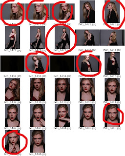
I then went on to circle in red the images I decided were the best for my magazine and circled them in red, by creating a new layer over the contact sheets. I will paste below the contacts sheets once circled:

From this, I am taking the images and editing them one by one so that they follow my color scheme. I will post an update of how these images turn out. I will also embed those images into that post.
From the photos I have selected, I have also taken two example images, one that I like and have chosen to use, and one that I dislike and have chosen against using. I think it is important that I fully develop my ideas and explore which images are suitable and why.
Image I like: This is image feature a close up shot of my model, in which an element of emotion and mysteriousness can be seen. I really love the way in which she is looking upwards as I feel this portrays ideas of hope and optimism within her eyes. The connotations of this image are ideal due to the associated of emotion, linking in with the variety of emotions featured within music, and therefore the range of emotion within my magazine. As my genres are contemporary R&B and indie rock, the songs that are encompassed by these genres will completely range in moods, tones and topics, from love, to anger, to fear, and even misery. I believe an image with intense emotion completely relates to the music and theme of my magazine, and that is why I really like this image and plan on using it. I also particularly enjoy the lighting in this image, and the way the use of make up allows the light to completely bounces from her cheekbones, as well as the way the light highlights the use of red glitter within the make up. The use of red is very important within my magazine due to its prestige within my colour scheme and its various positive connotations. However, I will be making use of photoshop to edit out the area of light on the models nose, due to its unnecessary stand-out effect.
Image I dislike: Although, I like the use of shot within this image (low-angle shot, displaying power, higher status, strength), I believe the lighting within this image is too dark to highlight the model's complexion, as well as the use of red within the image. The red glitter around the eyes does not appear to be reflecting any light, and there is an element of darkness to it that I don't believe would work with the black and white of the image, once photoshopped. I also believe the model's pose looks slightly uncomfortable and doesn't not appear to have many positive connotations. Therefore, I shall not be using this image.


No comments:
Post a Comment