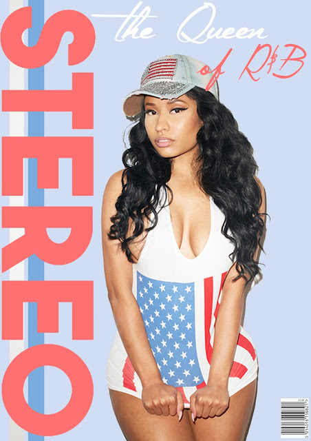
To also prepare myself for the creation of my final product, I stuck with an artist from one of my genres, of 'R&B'. This creates a more clear idea of how my final product will appear with an artist of that genre.
 I have used tools such as the eyedropper tool to collect colors that I used within my masthead and main cover line. I haven't used a large amount of cover lines within my cover other than the main cover line 'the Queen of R&B'. This is because I have noticed that a various high end, popular magazines use a lack of cover lines due to their popularity guaranteeing monthly/weekly sales. This creates an element of prestige within the theme of the magazine and also allows the audience to focus on the model in question. I believe this fits my practice magazine very well as I'd like the audience to focus on Nicki Minaj (the artist in question), and immediately relates the singular cover line to her, informing the audience that the magazine is speaking of her as 'the Queen of R&B'. All of the colors used around the main image are taken directly from the main image itself in order to display a running color theme. This isn't the same color themes as my final product but I wanted to experiment my use of color theme and how to create a theme that links in with the image and creates a professional look.
I also used the text tool in order to print a price onto the barcode that I embedded into the cover, in order to keep the magazine looking professional and to assist anyone who wishes to purchase it, as then they will be aware of the price of the magazine and the shop in which they purchase the magazine from can scan the barcode.
I also used tools such as the rectangle shape tool in order to create the lines that run behind the masthead. The masthead itself takes up the whole left third of the cover, which is convenient for the way in which magazines are placed within shops (displaying the left third only). This is informative to the audience but also gives the magazine a different look, differing to the normal masthead which is typically placed at the top of the page.
Overall, I am very pleased with the outcome of my practice magazine cover and I am satisfied with the skills and techniques that I am confident with on photoshop, leaving me feeling more confident to begin creating my final product.
No comments:
Post a Comment